The stock market is once again running with the bulls, with the S&P 500 (SNPINDEX: ^GSPC), Dow Jones Industrial Average (DJINDICES: ^DJI), and Nasdaq Composite (NASDAQINDEX: ^IXIC) all up double digits on the year.
If market sentiments remain positive, all three major indexes could end 2026 with their fourth consecutive year of double-digit annual returns. That hasn’t happened since before the dot-com bubble popped in 2000.
Missed Nvidia in 2009? This Rare Signal Is Flashing Again. In 2009, a “Double Down” signal flashed for a little-known chipmaker called Nvidia. For the first time in years, that same “Total Conviction” signal is flashing for a company 1/100th the size of Nvidia. Continue »
The year hasn’t, however, been uniformly positive; several stocks have endured bouts of volatility, and much of the market’s strength remains concentrated in a relatively small group of megacap companies. Indeed, beneath the surface of this year’s growth, there are reasons to question how long this rally can reasonably continue, including a warning sign that today’s market is historically expensive.

The market is in rarified territory, and that might not be a good thing
Nobody can predict a market crash or downturn, and I definitely don’t pretend to be more farsighted than I am. At the same time, there are valuation signals that shouldn’t be ignored. They can’t tell us when a correction will happen, but they can remind us to be cautious and deliberate at times when exuberance might be governing the market.
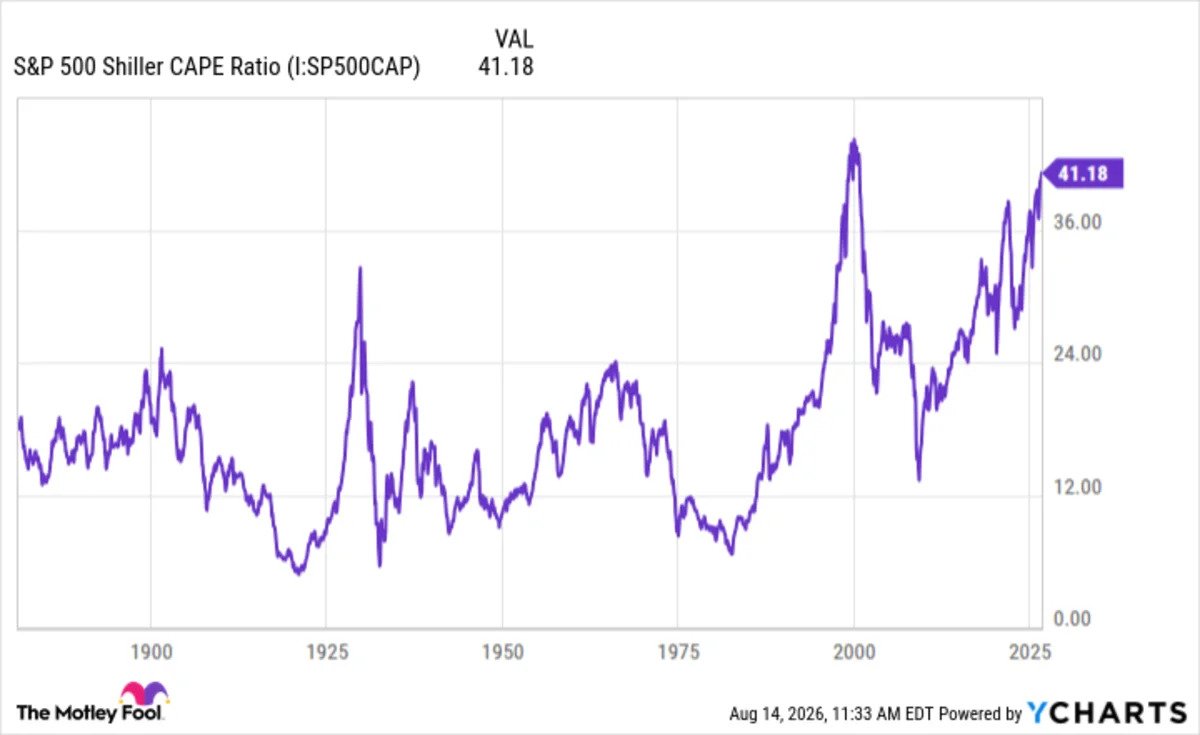
One of these metrics is the S&P 500 Shiller CAPE ratio. In simple terms, the CAPE ratio shows how much investors are paying today for every dollar of earnings the S&P 500 has produced, on average, over the last 10 years. The higher the ratio, the more expensive the market looks relative to its history; the lower the ratio, the cheaper.
Over roughly 150 years of market history, the CAPE has averaged about 17. The figure has crossed the 24 marker on six occasions, and for much of the last decade, it has remained above that line. Only twice has the CAPE risen above 40. The first was in the years leading up to the dot-com bust, and the second is happening now.
The market’s current CAPE is about 41.

Historically, a figure above 30 is very expensive territory; since it’s only happened once before, this figure has almost no historical precedent. All we can say is that the market, on an adjusted-earnings level, is where it was in the years leading to the dot-com crash. That’s not a reassuring comparison, but then again, history has given us only one other precedent, and that’s too small a sample size to declare another crash is inevitable.