September has a bit of a bad rep on Wall Street. The ninth month of the year has historically delivered negative or weaker returns with such consistency that it has even been dubbed “The September Effect.”
It’s a market anomaly — an unusual pattern — but this year it is compounded with real market uncertainty. Among investor concerns: sticky inflation, rising energy prices, hawkish signals from bankers, high yields on U.S. Treasury bonds, a trade war between the U.S. and Canada, an actual war between U.S. and Iran, plus ballooning national debt and continued fears over an AI bubble.

Image source: Getty images.
These are, to be fair, just the negatives, and a complete picture would have to add the positives, such as soaring profits for S&P 500 (^GSPC -0.38%) companies, steady growth in the U.S. economy, and a stock market that is broadening beyond a few megacap leaders.
There is, however, one persistent concern that goes beyond September’s historically weak performance. One of the market’s most reliable valuation metrics has been flashing a warning light for months. And, if history is any guide, Wall Street won’t like what’s coming next.
History might be repeating
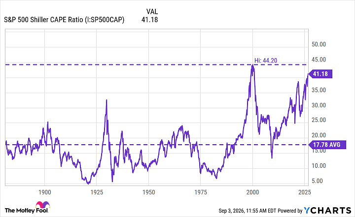
To be sure, there’s no metric that can tell us what’s coming next, no metric, for instance, that can predict a crash or correction. But there is one that is pretty good at comparing today’s market with predecessors to measure its valuation. That metric would be the CAPE — and right now, it’s in historically high territory.
Data by YCharts.
The CAPE, also known as the Shiller P/E, averages the S&P 500’s last decade of inflation-adjusted earnings. It smooths over one-time events, like recessions or profit surges, to give a clearer picture of how expensive stocks are. Higher CAPEs typically signal that the market could be overvalued, while lower ones mean the opposite.
When you look at the chart, you’ll notice three figures. There’s the average, which, over 155 years, sits at about 18. Then, there’s the highest CAPE ever recorded, 44, which came during the dot-com era. Then there’s today’s CAPE, roughly 41.
A period with a higher-than-average CAPE reading has historically preceded a period with weaker long-term returns. In extreme cases, the former precedes major market declines, corrections, and outright crashes. The two aren’t causally related — a high CAPE reading doesn’t cause a market crash — but the reading does tell us that stocks look historically expensive and are therefore more vulnerable to whatever triggers the next sell-off.
If history repeats itself, today’s bull market could end the same way as the dot-com era’s. But history doesn’t always repeat — more accurately it rhymes — and there’s no way of asserting with any certainty that today’s market is destined for the same catastrophic ending that popped the dot-com bubble. Even if the market did experience a period of weaker returns, many of today’s companies could continue growing their earnings and rewarding investors who stuck with them through the turbulence.
What should investors do?
The important thing is not to overreact. Panicking, trying to time the market, or selling great companies indiscriminately could do more damage than a downturn itself.
In fact, the best thing to do right now is to stay invested in companies you believe in no matter what happens in the larger market. That’s easier said than done. Instincts take over when heavy losses are piling up and bad headlines are coming in from every side. You might even think yourself foolish for staying invested — but history has often rewarded investors willing to look a little foolish in that sense.