kokouu/E+ via Getty Images
The purpose of this article is to examine the fiscal flows for Japan to assess how the stock market can make all-time new highs at the same time that the economy is in recession and whether there are more gains to expect from the stock market to come.
A rising stock market while the economy tanks is a novel situation that has also occurred in Germany and you can read about that here in an article I wrote a short time ago.
The assessment will be made by an examination of key fiscal flow information from the national accounts and domestic banking information and forward trends.
The three main sources of fiscal flows in the Japanese economy are:
1. Federal government spending. [G]
2. The current account balance. [X]
3. Bank credit creation. [C]
These add together to provide a figure for aggregate demand [AD] after the formula:
AD = G + X + C
A chart of the stock market for Japan is shown below.
Trading Economics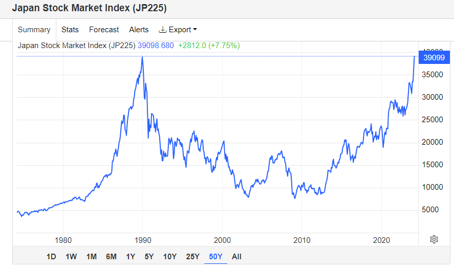
The chart above shows that the Japanese stock market has risen to a point where it is now making all-time new highs for the first time since 1990, that is 34 years.
In theory, at least there should be no long-term investor in Japan that is underwater on his stock market portfolio.
New all-time highs are a very bullish scenario, especially after such as long time.
Let us see if we can work out how this has happened at the same time that the economy has slipped into recession. The stock market is not the economy; however, it is strongly affected by it and vice versa.
Federal Government Spending
The chart below shows federal government spending for Japan.
Trading Economics
This very long-term view going back to the 1970s was chosen as it shows the fiscal background leading up to the great boom and bust of 1990. The chart shows that at the peak of the boom in 1990 the government was running a surplus budget of about 2% of GDP.
What this means in national accounting terms is that at the peak of the boom and in the time leading up to it the government was removing money from the domestic economy.
In 2022 the situation is the reverse. The government is spending money into the economy at the rate of 6.4% of GDP and this trend of deficit budgets is set to continue.
The chart below shows the GDP for Japan over the same time horizon as the charts above.
Trading Economics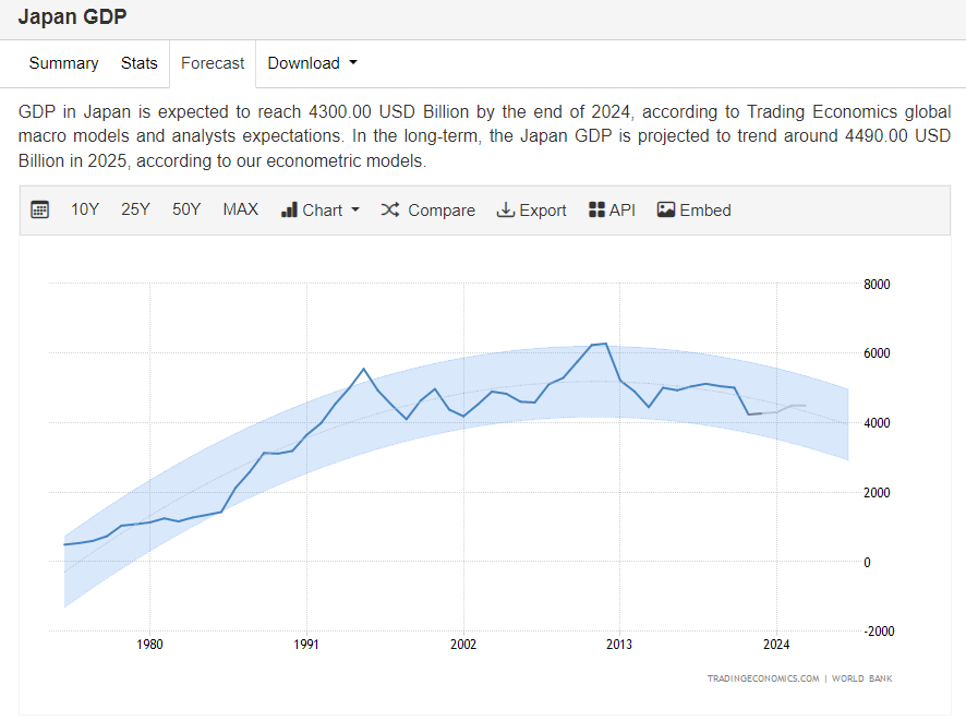
The chart shows that Japan’s GDP has been moving sideways since the boom bust of 1990. At 6.4% of GDP and a GDP of USD 4232B the government is injecting some $270B into the domestic economy each year.
Adding money into the private domestic sector is positive for markets.
The chart forecast shows that the government deficit is set to decline going forward and will be contributing less to the private sector than previously. This is a negative trend and works against rising asset prices. That said the input is still positive and not negative as it was in the lead-up to the spectacular boom bust of 1990.
Current Account Balance [CAB]
The chart below shows the current account balance over the same time horizon as the charts above.
Trading Economics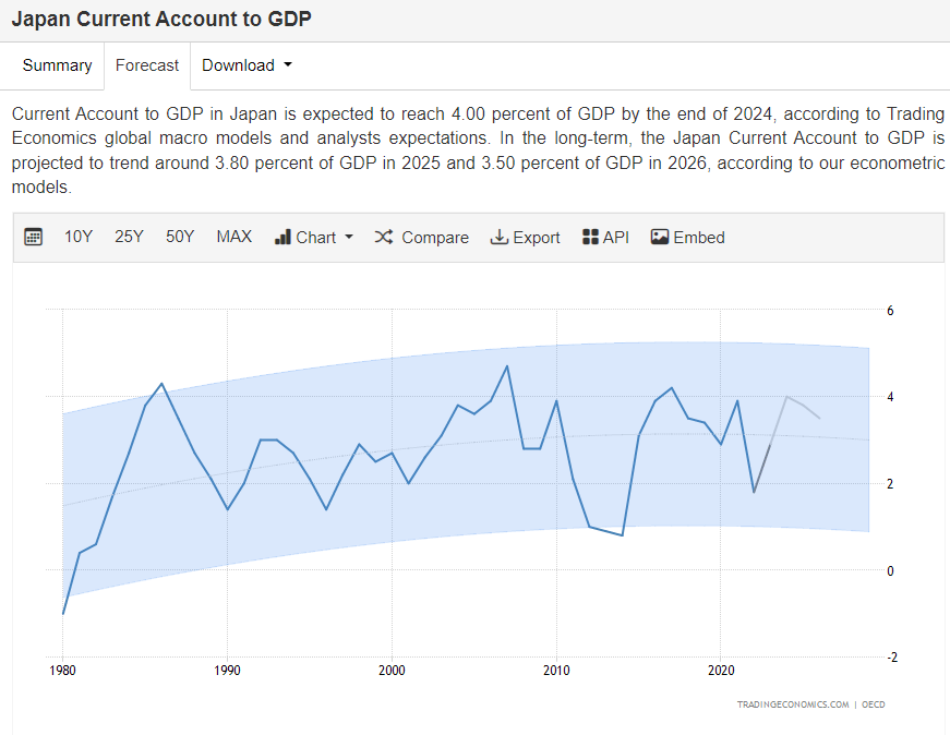
From the chart above one can see that Japan has had a positive surplus current account balance since the 1980s. At present the CAB is about 1.8% of GDP and is forecast to rise. 1.8% of GDP is an injection of USD 76B per year into the private domestic sector and a positive for asset markets.
A future increase of the CAB to 4% of GDP as per the chart forecast would put the contribution to the private domestic sector at USD 169B per year.
An increase in fiscal flows like this is positive for asset markets.
The third source of fiscal flows that add to aggregate demand comes from bank credit creation.
Bank Credit Creation
The chart below shows bank credit creation over the same time horizon as the charts above.
Trading Economics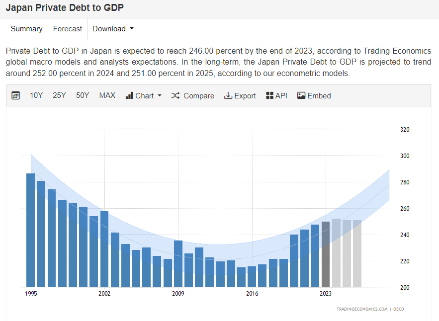
The chart shows that bank credit expressed as a percentage of GDP has been falling since 1995, bottomed in 2016, and has been rising ever since in a fairly narrow range from 280 to 250 percent of GDP.
The forecast shows that bank credit creation is to continue rising in the next few years.
The table below shows the amount of bank credit creation over the last few years and also forecasts forward to 2026.
| Year | % of private debt to 2022 GDP | $USD Amount | Change year on year $USD Billion |
% GDP |
| 2021 | 243.9% of 5005B USD | USD 12162B | NA | NA |
| 2022 | 247.3% of USD 4232B | USD 10465B | -1697 | NA |
| 2023 | 249% of USD 4232B | USD 10537B | 72 | 1.7 |
| 2024 | 253% of $4232B USD | $10706B USD | 169 | 4 |
| 2025 | 251% of $4232 USD | $10622B USD | -84 | -1.9 |
| 2026 | 251% of USD 4232 | USD 10622B | 0 | 0 |
The data in the table above is a conservative estimate of the bank credit creation contribution to fiscal flows because it is calculated using the GDP figure from 2022 whereas GDP would most likely be larger each year as would any number factored from it.
What the data does show is that credit creation added $72B to the economy in 2023 and that the contribution in 2024 will be a much larger $169B and represent 4% of GDP.
This is a positive fiscal flow and good for asset markets.
Adding it all together
When one takes the data above and adds it all together as per the formula introduced at the beginning of this article one produces the following results.
| Year | G % of GDP | X % of GDP | C % of GDP | AD % of GDP | $USD Billion |
| 2022 | 6.4 | 1.8 | 0 | 8.2 | 347 |
| 2023 | 5 | 2.8 | 1.7 | 9.5 | 402 |
| 2024 | 3.75 | 4 | 4 | 11.75 | 497 |
The table shows that Japanese asset markets are being pushed up by a rising aggregate demand fueled by positive monetary inflows from the government and current account balance and also from bank credit creation.
This trend is set to continue until at least 2026 given the forecast range on the charts above.
When one charts the sectoral balance information above the following chart is produced.
FRED and author notations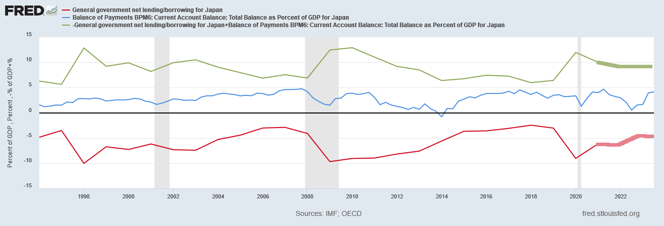
Readers can view this chart online using this interactive link.
The chart illustrates with the green line the private domestic sector balance. The green line is in positive surplus territory and is the sum of the blue current account balance line and the red federal government budget line. What the chart does not include is the additional impact of credit creation.
The grey bars are recessionary periods. Generally speaking when the lines pinch together eventually a recession occurs. The lines widen again and the recession passes. The key to warding off a recession is to ensure that the private-domestic sector balance remains in surplus by as wide a margin as possible with full employment and stable prices.
The thicker portions of the green and red lines have been added by myself and represent the forecast future sectoral balances based on current information.
The important point is that the private domestic sector balance in green remains in surplus and is sustained in that condition for several years into the future and this is very fertile ground for asset markets to grow in.
Can the stock market rally continue
The macro-fiscal flows show the stock market rally has occurred due to strong and expanding fiscal flows into the private domestic sector where asset markets are located. The forecast for the next few years to 2026 shows that these flows will remain and expand thus giving asset markets in Japan the fiscal space they need to also expand.
So the answer is a resounding yes and it is not too late to get in and there are several years of solid growth ahead in my view. At least until 2026.
An investor wishing for exposure to Japanese markets might consider the following exchange traded funds [ETFs] and so overcome the problem of not being able to trade locally.
Seeking Alpha
The (EWJ) ETF shown above has over $16B in assets under management a yield of 1.89% and a positive price trend.
The following analytical chart from ANG Traders shows how the stock is in a bull trend and has many positive indicators speaking for it.
ANG Traders of the Away From the Herd Seeking Alpha Investor Group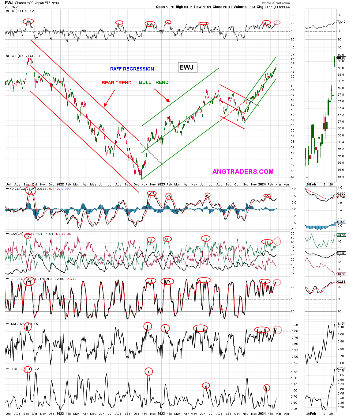
It would be wise to wait for a pullback before buying more or buying in however there may not be one.
It could be a case of Buy High and Sell Higher: Famous stock trader William Delbert Gann believed that if an asset makes a new high, it has the potential to reach even higher levels. This fiscal flows are suggesting this is the case in this instance.
Seeking Alpha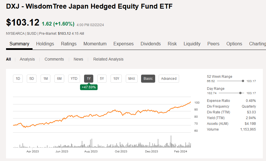
The (DXJ) ETF shown above has assets under management of over $4B a yield of 2.94% and a positive price development line.
(EWJ) might have a lower yield however it is far larger and has been trading for longer and one can chart it back into the mid-1990s.
Both of the above funds are large and liquid and one should not have to worry about being able to get in and out of the fund when one needs to or that it is traded too thinly and might be wound up on short notice.
A nation does not trade alone and to a large extent is hostage to how the rest of the world is developing. The chart below shows the spending patterns of the five largest national governments [the G5] and the five largest central banks [the C5].
Mr Robert P Balan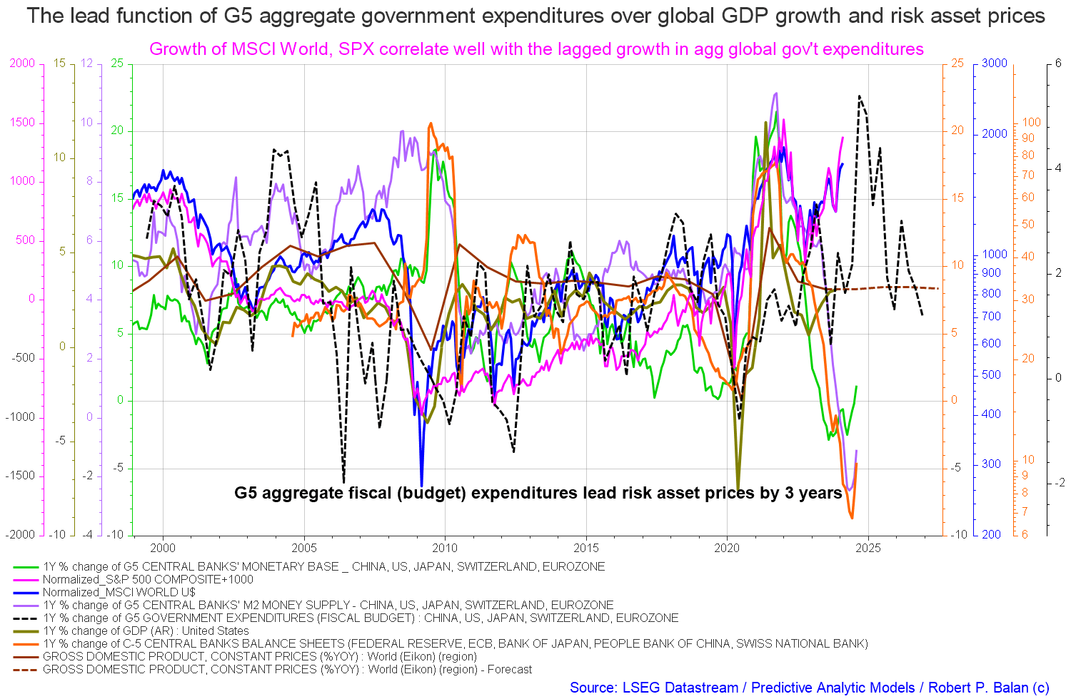
The black dotted line on the chart above shows the lagged impact of the combined spending power of the largest world governments. The line is rising into 2025. At the same time, the five largest central banks are expanding the monetary base, green line, as well as the M2 money supply, purple line, and expanding their balance sheets, orange line.
This is a favorable world macroeconomic investment scenario within which to also consider an investment in the asset markets of Japan.
Another factor speaking for Japan is its very sensible monetary policy stance. While the rest of the world, led by the USA, has embarked on a campaign of interest rate raises “to combat inflation”, and in so doing undermined their economies, Japan refrained from this arguably misguided policy and left its policy rate unchanged. Japan has been rewarded with stable prices high employment and low inflation.
The chart below shows the long-term policy development of the central bank interest rate. The high-interest rates that helped destroy their economy in the catastrophic market boom bust of 1990 are unlikely to ever be repeated in living memory in my opinion.
Trading Economics
The chart and commentary above show that Japan has both low-interest rates and low inflation.
I believe the government and central bank of Japan understand that higher interest rates drive inflation, they do not lower it and are so far the only advanced Western economy to show an understanding of this concept. This important point speaks to how better managed the Japanese economy is compared to other advanced Western economies.
This article was written by
Analyst’s Disclosure: I/we have no stock, option or similar derivative position in any of the companies mentioned, and no plans to initiate any such positions within the next 72 hours. I wrote this article myself, and it expresses my own opinions. I am not receiving compensation for it (other than from Seeking Alpha). I have no business relationship with any company whose stock is mentioned in this article.
Long equities and real estate
Seeking Alpha’s Disclosure: Past performance is no guarantee of future results. No recommendation or advice is being given as to whether any investment is suitable for a particular investor. Any views or opinions expressed above may not reflect those of Seeking Alpha as a whole. Seeking Alpha is not a licensed securities dealer, broker or US investment adviser or investment bank. Our analysts are third party authors that include both professional investors and individual investors who may not be licensed or certified by any institute or regulatory body.