This report has a smorgasbord of topics, including the latest Fed meeting, thoughts on market performance around Fed cycles, the blowout January jobs report, corporate earnings, and the relationship between bond yields and stocks. Strap in.
For our detailed commentary on the January Federal Open Market Committee (FOMC) meeting, see this from our posting last Wednesday. The net is that Fed Chair Jerome Powell was very clear that the Committee’s bias is against initiating rate cuts as soon as the March FOMC meeting. Friday’s release of the Bureau of Labor Statistics (BLS) jobs report for January likely cemented a later start to rate cuts this year.
We won’t deep-dive the jobs report in this report, but here are the salient details:
- Payrolls were up 353K, well above expectations, with broad-based strength across sectors.
- Annual benchmark revisions suggest recent job growth has been stronger than initially expected.
- Household employment was negative again, but stripping out new BLS population controls yields a healthy increase.
- The unemployment rate remained steady at 3.7% alongside a rise in labor force participation.
- Wage growth picked up, but there was a decline in average weekly hours worked (perhaps due to unseasonably cold weather around the country).
Fed cycles and market returns
Although Powell directly talked down the probability of a March start to rate cuts, the Fed did drop its tightening bias. This more firmly points to the July 2023 rate hike as the final hike in this cycle, begging much chatter about what this all means for equities. It’s not as clear-cut as many would suggest.
Yes, it’s quite easy to look at past Fed cycles and calculate average stock market performance over various periods associated with the full cycle. Shown below is the average performance of the S&P 500 leading into the final hike of each of the prior 14 rate cycles (since 1929). We also show the more recent performance since what we presume is the final hike in this cycle, back in July 2023. Indeed, after a weak period around the mini banking crisis last year (the low point of the turquoise line), stocks have staged a remarkable recovery. That’s all great, but the analysis should not stop here.
Current vs. average performance
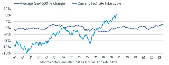
Source: Charles Schwab, Bloomberg, Federal Reserve, 1929-2019.
Current Fed rate hike cycle (thru 2/2/2024) assumes terminal hike occurred on 7/26/2023. Indexes are unmanaged, do not incur management fees, costs and expenses and cannot be invested in directly. Past performance does not guarantee future results.
Importantly, as shown below, the range around that average performance is huge. Not only that, 14 cycles constitute a relatively small sample size. Any time you’re dealing with data associated with a small sample size, but an extremely wide range, caution is warranted around analyzing the average. Essentially by definition, under those circumstances, none of the individual outcomes actually looks like the average; which is why we bristle at analyses of this topic that use phrases like “stocks typically (do something or another).” It’s why we remind folks of the old adage, “analysis of an average can lead to average analysis.”
Wide array of past outcomes

Source: Charles Schwab, Bloomberg, Federal Reserve, 1929-2019.
Current Fed rate hike cycle (thru 2/2/2024) assumes terminal hike occurred on 7/26/2023. Green shading represents best historical performance before and after last Fed rate hike. Red shading represents worst historical performance before and after last Fed rate hike. Indexes are unmanaged, do not incur management fees, costs and expenses and cannot be invested in directly. Past performance does not guarantee future results.
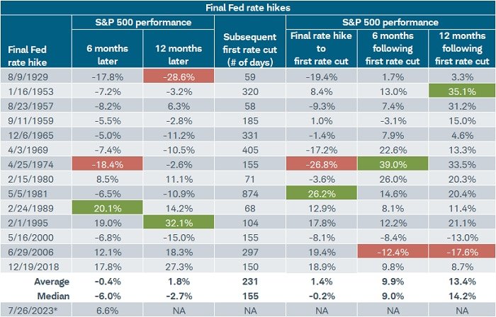
The table below highlights the details associated with the ranges shown above. It covers various time periods, including: S&P 500 performance six and 12 months following the final rate hike in each cycle; the number of days between the final rate hike and the first subsequent rate cut; performance associated with those “pause” phases; and finally, performance six months following the initial rate cut. The red and green boxes highlight the low and high for the performance range for each.
Source: Charles Schwab, Bloomberg, Federal Reserve, 1929-2/2/2024.
*Assumes terminal hike for current rate hike cycle occurred on 7/26/2023. Green shading represents best S&P 500 performance and red shading represents worst S&P 500 performance. Indexes are unmanaged, do not incur management fees, costs and expenses and cannot be invested in directly. Past performance does not guarantee future results.
As shown, for the 12 months following final rate hikes historically, the range for S&P 500 performance is -28.6% to +32.1%, with eight negative outcomes and six positive. In terms of the span of time between the final rate hike and first rate cut (the “pause” period), it was less than 60 days in 1929 and 1957, and nearly 900 days in 1981. The performance span for the S&P 500 during those pause periods ranged from -26.8% to +26.2%, with seven positive periods and seven negative.
It does start to lean more positive once the Fed started to cut rates. Although the ranges were still wide, there were only three negative outcomes six months later, and only two 12 months later. The most negative outcome during the pause period was in 1974, when stocks were still reeling from the brutal recession at that time; the best performance was in 1981 after the Fed, under Paul Volcker, had slayed the inflation dragon. The most negative outcome following an initial cut was in 2006-2007 during the lead-in to the Global Financial Crisis.
We expect volatility to pick up in the equity market as it grapples with the crosscurrents likely to persist in terms of economic and inflation reports. Whereas every major index moved directly in contrast to the extreme moves in Treasury yields last year, it has shifted this year to stocks down the capitalization spectrum. The Russell 2000 has had its swings more directly tied to changes in yields given the generally higher interest-rate sensitivity of smaller companies, especially via credit channels.
Helping keep larger cap stocks and the indexes they dominate—like the S&P 500 and Nasdaq—in stronger uptrends has likely been the combination of their generally lower sensitivity to monetary policy uncertainty and stronger earnings fundamentals.
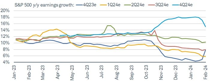
The three months leading into the early days of fourth quarter 2023 reporting season for the S&P 500 were characterized by decelerating earnings expectations. Not only were there declining estimates for last year’s finale quarter, the first three quarters of this year were revised lower as well. As shown below, there has been a slight improvement recently in the first three quarters’ estimates, largely thanks to the surge in last quarter’s blended estimate (more on that below). However, offsetting that to some degree is the rolling over in this year’s fourth quarter estimate.
Wavy pattern of estimates
Source: Charles Schwab, LSEG I/B/E/S, as of 2/2/2024.
Forecasts contained herein are for illustrative purposes only, may be based upon proprietary research and are developed through analysis of historical public data. Past performance is no guarantee of future results.
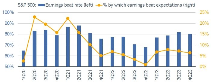
In keeping with historical patterns, ultimately the bar for last quarter was set sufficiently low to allow for better-than-average “beat rates” as well as the percent by which companies have been beating consensus estimates. As shown below, through Friday, nearly half of the S&P 500 had reported earnings, with a beat rate (blue bars) to date of more than 80% and the upside surprise (yellow dots) running at more than 6% in aggregate terms.
Source: Charles Schwab, LSEG I/B/E/S, as of 2/2/2024.
Indexes are unmanaged, do not incur management fees, costs and expenses and cannot be invested in directly. Past performance does not guarantee future results.
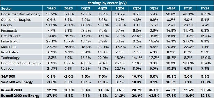
Thanks to a few stellar reports from within the Magnificent 7 (Mag7)—notably Meta, Amazon, and Alphabet (Google)—the blended estimate (combining reports already in the books with reports yet to come) has jumped to nearly 8%. That’s up from 4% at the start of the reporting season. The table below highlights the expected trends from last year through this year, both at the individual sector level and the aggregate index level (bolded in the bottom rows).
Source: Charles Schwab, LSEG I/B/E/S, as of 2/2/2024.
S&P 500 sectors shown. Forecasts contained herein are for illustrative purposes only, may be based upon proprietary research and are developed through analysis of historical public data. Past performance is no guarantee of future results.
For comparison purposes, in the table above we added the summary rows for the Russell 2000, showing the “swing factor”—the change from 2023 to 2024, shown in far-right columns—is expected to be much larger for small caps. Although estimates are always a moving target, it’s expected that S&P 500 earnings will swing from 3.6% in 2023 to nearly 10% in 2024; for the Russell 2000, the swing is expected to go from -11.4% to +26.5%. As an important aside, we continue to believe there are opportunities outside segments like the Mag7; but when moving down the cap spectrum, it’s advisable to stay up in quality and look for profitable companies with strong cash flows, healthy balance sheets, ample interest coverage, and lower volatility levels.
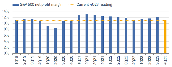
As noted above, earnings results have beaten expectations so far; but the same can’t be said for revenues, where the beat rate is running at a more tepid 62% (below the recent average). That spread brings net profit margins into sharper focus looking ahead. As shown below, following a three-quarter uptrend, margins have hooked lower again. It’s why, in addition to the quality-based factors noted above, we would add profit-margin stability and/or growth to the list of focus factors.
Source: Charles Schwab, FactSet, as of 2/2/2024.
Indexes are unmanaged, do not incur management fees, costs and expenses and cannot be invested in directly. Past performance does not guarantee future results.
With the blowout January jobs report helping boost bond yields considerably, it’s worth providing an update on the dynamic between yields and stock prices—and how there could be signs of a temporary shift afoot. Regular readers are likely aware that we have been focused on whether a new era is upon us; one in which the correlation between changes in bond yields and stock prices remains negative (in a secular sense). As mentioned in our 2024 outlook, this would be consistent with the “Temperamental” era that ran for three decades prior to the “Great Moderation” era, which ran from the mid-1990s up until the pandemic.
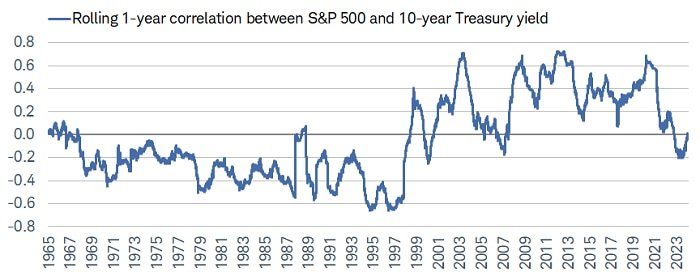
As shown in the chart below, the rolling one-year correlation between yields and stocks has mostly been negative for the past year. That coincided with rates rising (falling) for the wrong (right) reasons in that inflation was becoming more (less) of an issue.
Source: Charles Schwab, Bloomberg, as of 2/2/2024.
Correlation is a statistical measure of how two investments have historically moved in relation to each other, and ranges from -1 to +1. A correlation of 1 indicates a perfect positive correlation, while a correlation of -1 indicates a perfect negative correlation. A correlation of zero means the assets are not correlated. Indexes are unmanaged, do not incur management fees, costs and expenses and cannot be invested in directly. Past performance is no guarantee of future results.
We continue to think a return to the “Great Moderation” is unlikely. Yet, a zoomed-in look at the far-right portion of the chart shows that the negative correlation has recently faded; so, bond yields and stock prices aren’t moving as strongly in opposite directions. Notably, that suggests that yield moves driven by stronger economic growth and not accelerating inflation is typically cheered by stocks. Importantly, though, it also means that if the relationship between yields and stocks flips back to positive, a decline in bond yields could signal more economic weakness, thus weighing down on risk assets.
Good news or good news first?
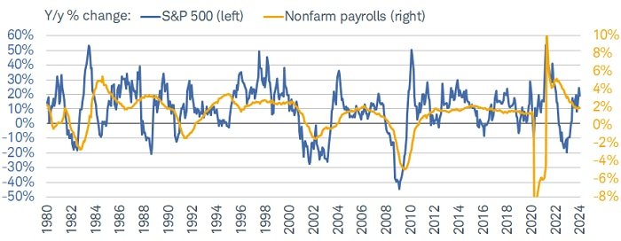
Since the Fed started its rate-hiking campaign, “good economic news is bad stock market news” (and vice versa) has been the pervasive narrative—suggesting strength in the labor market would force the Fed to be more hostile towards risk assets. Historically, it’s actually fairly common to see stocks do well when the labor market is adding jobs. As shown below, the year-over-year percentage change in the S&P 500 and nonfarm payroll growth tend to track each other well over time. To be sure, there are some instances in which stocks have suffered even as the labor market hummed along, but most were during non-recessionary bears or corrections (like 2022 and 2016, for example).
Source: Charles Schwab, Bloomberg, Bureau of Labor Statistics, as of 1/31/2024.
Nonfarm payrolls y-axis truncated for visual purposes. Indexes are unmanaged, do not incur management fees, costs and expenses and cannot be invested in directly. Past performance is no guarantee of future results.
On average, as shown by the table below, annual gains for the S&P 500 have been healthier when payroll growth is positive. However, in keeping with the aforementioned adage about averages, the two far-right columns of the table show that the best and worst year-over-year gains when payrolls were positive were 53.4% and -41.8%, respectively. Conversely, the best and worst gains when payrolls were negative were remarkably similar at 53.7% and -44.8%, respectively.

Source: Charles Schwab, Bloomberg, Bureau of Labor Statistics. 1950-1/31/2024.
Max indicates best return in period while min indicates worst return in period. Indexes are unmanaged, do not incur management fees, costs and expenses and cannot be invested in directly. Past performance does not guarantee future results.
The implication is that in some cycles, there have been months in which it didn’t necessarily matter whether the year-over-year change in payroll growth was positive or negative; the market either soared or plunged. Not only does that argue in favor of staying invested—even when job growth is softening—but it shows how there can sometimes be disconnects between the market and the economy, especially in unique cycles like the one in which we find ourselves.
For now, a strong labor market has not prevented a continued slide in inflation. Although the Fed dropped its tightening bias, it is also in no rush to start lowering rates in the interest of allowing more time for the “long and variable lags” associated with monetary policy and its economic impact. Earnings season has helped lift stocks given better-than-expected results, but we do expect equity-market volatility to pick up after earnings season alongside continued uncertainty with regard to the Fed’s reaction function.


