Adam Spatacco, The Motley Fool
5 min read
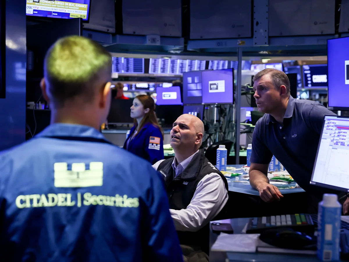
With all of the volatility in the stock market this year, most investors probably don’t realize the S&P 500 (SNPINDEX: ^GSPC) is sitting at a precarious peak. The index’s cyclically adjusted price-to-earnings (CAPE) ratio now hovers near a reading of 41 — a territory that historically signals serious trouble ahead.
The CAPE ratio captures something deeper than daily price movements: It reveals how much investors are willing to pay for every dollar of long-term earnings power. At its current level, the S&P 500 appears to be pricing in unprecedented levels of optimism while quietly laying the foundation for a painful reckoning.
Missed Nvidia in 2009? This Rare Signal Is Flashing Again. In 2009, a “Double Down” signal flashed for a little-known chipmaker called Nvidia. For the first time in years, that same “Total Conviction” signal is flashing for a company 1/100th the size of Nvidia. Continue »
All told, the index looks like it’s on a collision course with economic reality, and history suggests the landing may be rough. Read on to learn why.

What is the CAPE ratio and why does it matter?
The CAPE ratio was originally developed by economist Robert Shiller. The metric divides the current S&P 500 price by the average inflation-adjusted earnings per share (EPS) over the previous 10 years. By doing so, the CAPE ratio smooths out any temporary spikes or dips caused by recessions, economic booms, or one-time events. This approach gives a clearer picture of sustainable valuation across the index as a whole.
At face value, the price-to-earnings ratio can appear deceptively attractive in years of strong profitability. But the CAPE forces investors to look across full business cycles. The underlying data for the CAPE ratio stretches back to 1871 — more than 155 years of market history.
Across that span, the long-term average CAPE has hovered between 17 and 18. As the chart indicates, when the CAPE ratio climbs well above the 25 to 30 range, it has repeatedly warned that future stock returns will be disappointing.

At today’s reading of 41, the S&P 500 is not merely expensive by historical standards — it suggests the market is in an extreme zone where patience and realism become essential. While the CAPE ratio falls short of predicting exact timing, it has a flawless ability to show when risk accumulates and the margin of safety starts to disappear.
Analyzing historical CAPE readings
There are only a handful of periods where investors have witnessed the CAPE ratio sustain levels between 30 and 40. The common theme is that each time it ended badly.